Tuesday, May 31, 2011
Reading Reflection 04
I really enjoyed how Haskett concluded his book with Chapter 9 and Chapter 10. Chapter 9 "Contexts" focused on three main contexts: professional organization, business, and government policy. He also touched on public opinion at the end of the chapter as a fourth context. Professional organization is defined as how designers see themselves,allowing designers much free will and little structure that is associated with most professions. I find it very interesting how once a large company makes a mark and people start to recognize their products that you tend to begin to see other smaller companies coming out with similar products. I never realized how much the government uses design in other countries and the benefits that they have reaped from having these design councils. I think that the United States would greatly benefit from incorporating a design team and would perhaps enhance their strategies and outlooks for the country. I thought this chapter was very interesting. It emphasized how design was affected by these contexts, but were not dependent on it like other professions. It further shows readers how design differs from other jobs, but how it is essential in the way we live and evolve as humans. It's subjective nature sets it apart from professions that are primarily objective. Chapter 10 "Futures" describes how design has evolved throughout history. I am amazed in the technology that has been developed in the past couple of years, so I can only imagine being old enough to have seen the rapid evolution of the computer. The technologies that have been adapted and the advanced computers have made a significant contribution to the evolution of design. What designers are able to develop on computers now is incredible so I can only imagine what designers will be creating in the next ten or fifteen years. Design has began to focus on third world countries and impoverished communities. I think that this is opening a whole new realm of possibility. I like that designers has not just trying to develop the coolest, new gadgets, but also are making a conscience effort to better the world that we all live in. As time goes on, in evidently, more problems will arise in the world ( diseases, death, genetics, global warming, etc.). It will be interesting to see how designers respond to these changes and are able to adapt their concepts and ideas to target these new issues. It makes you wonder if there will ever be a time when technology and design catch up to what is happening in the world or if nature will always be one step ahead of us.
Journal 09: Coleman Project- Personal Documentation
Project as a Whole
I worked in a group with Becky Beaulieu, Erica Loughry, and Jonathan Thomas. The first day we were introduced to the project our group mainly focused on throwing out as many ideas as possible. We defined who Coleman is as a company. We believe that Coleman is a family-friendly company who pride themselves on the quality of their products. We tried to figure out what Coleman would want to be portrayed in their home products. Since Coleman emphasizes the environment we wanted to focus on environmental friendliness, as well as continuing to supply quality, reliable, and affordable products. After bouncing ideas back and forth, from wireless charging mats to our final product of solar shades. Our customers would be people who are looking to save money and redecorating their home. The shades would use to sun's energy to power a wireless outlet. At first Gabe was hesitate about the technology that would be required to make our product work. After doing some research, we figured out the it was feasible from then on everything fell into place. Jonathan had to most experience working with modeling programs and Google Sketch-up. He was the one who primarily designed the kiosk. Becky came up with some great packaging and logo ideas, so she focused on designing those. Erica worked with me on the Prezi as well as made the wireless outlet in Google Sketch-up.
Individual Contributions
My main contribution to the group was researching all of the technology and making sure that our product design was actually feasible. It was pretty difficult to find information about what we were specifically looking for. However, after reading a bunch of articles and finding a diagram that could not only explain to our group exactly what would happen in the process but also in an easy way for the audience. I also collaborated with Erica on the Prezi. We wanted to make sure that we used as little words as possible in the presentation and made it mostly visual. Since our product may have been out of the realm of peoples' believability we wanted to make sure that we showed a step by step orientation of how the product would work and how we came to those conclusions. I also designed and created the models that we passed around during our presentation. I felt like those were an important element to our presentation and it gave the audience an up close look at our product.
Our Prezi Presentation: Prezi
Section of Research

Overall, I really enjoyed working on this project. I also think that group projects are useful in helping students adapt to the workplace. It is important to draw on each members strengths and create the best product based upon that. I feel like we all brought different skills to the table but also meshed very well. I think our product turned out well. If given more time and more experience I would be interested to see where we could have gone with our design.
I worked in a group with Becky Beaulieu, Erica Loughry, and Jonathan Thomas. The first day we were introduced to the project our group mainly focused on throwing out as many ideas as possible. We defined who Coleman is as a company. We believe that Coleman is a family-friendly company who pride themselves on the quality of their products. We tried to figure out what Coleman would want to be portrayed in their home products. Since Coleman emphasizes the environment we wanted to focus on environmental friendliness, as well as continuing to supply quality, reliable, and affordable products. After bouncing ideas back and forth, from wireless charging mats to our final product of solar shades. Our customers would be people who are looking to save money and redecorating their home. The shades would use to sun's energy to power a wireless outlet. At first Gabe was hesitate about the technology that would be required to make our product work. After doing some research, we figured out the it was feasible from then on everything fell into place. Jonathan had to most experience working with modeling programs and Google Sketch-up. He was the one who primarily designed the kiosk. Becky came up with some great packaging and logo ideas, so she focused on designing those. Erica worked with me on the Prezi as well as made the wireless outlet in Google Sketch-up.
Individual Contributions
My main contribution to the group was researching all of the technology and making sure that our product design was actually feasible. It was pretty difficult to find information about what we were specifically looking for. However, after reading a bunch of articles and finding a diagram that could not only explain to our group exactly what would happen in the process but also in an easy way for the audience. I also collaborated with Erica on the Prezi. We wanted to make sure that we used as little words as possible in the presentation and made it mostly visual. Since our product may have been out of the realm of peoples' believability we wanted to make sure that we showed a step by step orientation of how the product would work and how we came to those conclusions. I also designed and created the models that we passed around during our presentation. I felt like those were an important element to our presentation and it gave the audience an up close look at our product.
Our Prezi Presentation: Prezi
Section of Research
Overall, I really enjoyed working on this project. I also think that group projects are useful in helping students adapt to the workplace. It is important to draw on each members strengths and create the best product based upon that. I feel like we all brought different skills to the table but also meshed very well. I think our product turned out well. If given more time and more experience I would be interested to see where we could have gone with our design.
Journal 10: Final Thoughts on the Course
I enjoyed Design 200 even more than I had initially anticipated. I have never taken a class that is based solely on participation, group work, and reflection. Instead of cramming for exams I actually was required to look at what I had learned or worked on and analyze it. I felt like I not only learned how to become a constructive critic of others work but also of my own. This is a very hard skill to acquire in my mind. Gabe encouraged us to be honest and that what we put in is what we will get out. This is an invaluable skill that I may never have be challenged with if I had taken Design 200 with Gabe. I definitely enjoyed reading the book by McDonough more than Haskett, however I definitely see the value and importance of Haskett. For students just starting their journey in design, it is important to understand the history and concepts of design. My favorite part of the quarter was the Coleman for the Home project. It allowed us to work together and incorporate all of the information and skills that we built throughout the whole quarter. It enabled me to see how much I have grown as a "designer" and how much more there is for me to learn. I am excited to continue to venture down this path and unravel even more things that I have yet to learn. Although I am only pursuing a minor in design, I believe that the basic skills that design requires will enable me to be a more creative and successful person in whatever I pursue in my future. Thank you Gabe for an amazing quarter. You definitely have a unique way of teaching, but I think it may be more effective than most teaching methods and your passion for design is apparent which only encourages students further.
Course Reflection 05
On the first day of presentations 6 groups presented their products. The idea was to create a home good for Coleman and target specific users, while also designing the product, the packaging, and the display kiosk. Group 2 introduced the HotTop which is a collapsible grill with a refrigerator underneath. I thought their product was cool because they tried to incorporate Coleman outdoor products into a home good design. I did however think that there kiosk design was kind of confusing. I wasn't sure what the purpose of the side shelving was. Group 3 came up with the idea of a revolutionary desk. I was very impressed by the group's product, packaging, and kiosk sketches. It added a different perspective since our was done completely on the computer. Group 5 presented an idea on a twin bed under a canopy that has drawers underneath. I wasn't sure how big the packaging was expected to be however, since the bottom wood part was quite large. Also I thought that they could have done more with the packaging, instead of just a suitcase looking thing. They had good ideas but the did not address the client nearly enough. I think that is one of the most important things. If the clients needs are not addressed and they don't see anything that directly benefits them, they are not even going to sponsor the product for sale. Group 6 introduced a hammock that turned into a table. I like how their kiosk idea was half indoor and half outdoor. That way when long term Coleman users so the kiosk they have an easy transition into the home good section of Coleman. I also thought that their packaging was really interesting and unique. Group 7 presented the idea of collapsible bowls. When they first introduced the product I immediately thought that the product already existed and could not get that out of the back of my mind. Also I thought they could have added something to the display kiosk to make their product stand out and grab attention, it was a little too simple. Group 8 presented the idea of EcoStat, which is an app for smartphones, itouch, and ipads. It is used to show how much energy savings they have accumulated. I thought that their graphics were really well done and it looked like they spent a lot of time of them. I also liked their kiosk because it reminded me of a revised Apple Store, very simple and sleek. Group 9 created a white board lamp that they named Elements. It had magnetic shelves that are detachable from the lamp. I liked their packaging idea with the sleeve so that the box is reusable. I felt like their kiosk really didn't add anything to enhance their product however. The Nature Treadmill was created by group 10. I thought that the idea was really unique and interesting. They had a very clear explanation of the product and why the user/client would be interested in the treadmill. I think that they spent a little too much time on the Wii product instead of promoting the treadmill. The Jacks designed Ustemsils which are detachable utensils. They used the fold-able cutting board that is also used for packaging. I thought this was a unique way to incorporate reusable materials. The Queens designed The Green Light. I was kind of confused about what the product actually was. They didn't have many pictures or sketches of their product. I think that would have helped instead of having a PowerPoint full of text. I really liked the idea that the Kings had for their Coleman for the Home product. They called it the Space Saving Cooktop and Table. I thought they did an amazing job showing their graphics and explaining exactly how the product would work in a way that people who do not know much about science could understand. It was a good idea that it is easily fold-able and that it does not need to be plugged in to receive power. The final group was the Aces. The did a product called the Deluminator. It was essentially an expandable rod that can be used to take a light bulb out or screw it back into place. The top it also detachable and it comes with a paint roller accessory. I think I have seen a product like this before but it was cool how they made it so that accessories could be taken on and off and used for different tasks. Overall, I really enjoyed hearing about all of the groups ideas. I always find it interesting the vast range of creativity that comes from different groups of people. I think I learned a lot by hearing everyone talk about their designs.
Monday, May 23, 2011
Course Reflection 04
The past four classes we have been working on Assignment 05, which is Coleman for the Home. Our job as a group was to create a product that Coleman could use as a home good. After the first day my job was off to a great start with coming up with ideas. We started with one idea and just kept feeding off of it until the final product evolved. I think that brainstorming out loud and bouncing ideas off of all of the group members really helped to incorporate all of our creativity into the best possibly product. From there we started to figure out the logistics of our product and had to make sure that technology was up to date with our idea, which is was. After that everything just seemed to fall into place. We are presenting tomorrow and hopefully everyone will be as excited about our idea as we are. Everyone in the group worked really hard and had different talents to add to the group. This made it easy to split up the work to produce the best presentation possible. I really enjoyed working on this project. I think it was a great way to end the quarter or Design 200 and really put design as a minor into perspective. Needless to say, I am very excited about what more the program has to offer.
Journal 08: Media Reviews
Design & Color
1) How Color Influences Consumer Behavior
2) Seeing Through the Eyes of the Color-Blind Shopper: Developing Dialogues for Understanding
3) How Color Affects Your Marketing
4) Infographic: How Color Affects Our Purchasing Habits
5) Study Hints at How Colors Affect Human Behavior
6) How Does Color Affect Learning?
I have always found color to be very intriguing. It has an unexplainable way of completely changing the mood of something. Brightness and vibrancy usually indicate excitement and fun, while cool, dark colors tend to show solemness, sadness, or calmness. Based on the articles that I have read and the research that has been done on color I feel like there is a strong correlation between color and the way people respond to products. In class we briefly discussed the color wheel and why color is essential in design, including communication of information, psychology of color, and color in branding and marketing. Many companies use colors so that consumers can associate certain information with special brands. I was specifically interested in this topic because I am a marketing major and learning about color can really help with my future career. Also, there are many suggestions of how certain colors convey different moods in humans. I found all of these correlations in class to be very interesting and made me want to explore color in more depth.
How Color Affects Consumer Behavior
According to this source, color is one of the most influential factors on websites, mail, and packaging. It states that red and orange are the two colors which are most likely used to encourage consumers to buy the product. Blue and green indicate safety, which is mostly used by banks and shows the user the seller can be trusted. There are several examples in this article of websites and how they use colors to encourage what they provide.
Seeing Through the Eyes of the Color-Blind Shopper: Developing Dialogues for Understanding
I found this article to be particularly interesting because it incorporates color and the issue of accessibility as well. The article brings up a very interesting and valid point about product marketing. Companies use bright colors to catch consumers attention, but single out the color-blind population from their branding. It addresses the concern that since color-blind people process color information differently, distortions affect how consumers select products and their ability to operate effectively in shopping environments. People think that warning labels should be printed with universal labels and in colors that are not prone to color distortion (i.e. red or green).
How Color Affects Your Marketing
Color has a non-verbal communication associated when consumers view products. Sometimes colors induce a physical response, such as a raise of blood pressure with red, and sometimes it has a cultural meaning. This source briefly introduces the color wheel so the audience can follow along with their thought process. Black= power and authority. Often used in fashion to make people look thinner. Also used to make other colors pop. White is worn by doctors to imply sterility and by brides to show purity. They bring up that colors can mean different things in different cultures (Eastern=mourning/funeral). They go on to describe many other colors and the associate connected with each. This source would be important for someone to look at if they are trying to induce a specific emotion.
Infographic: How Color Affects Our Purchasing Habits
This article introduces an infographic by KISSmetrics to show readers how colors affects their purchasing decisions. 93% of shoppers indicate visual appearance as the most important factor when shopping and that color in the primary reason they purchase a specific product. Specific colors are then introduced and are explained which kind of shopper it targets. For example, yellow grabs the attention of window shoppers. They also go through the colors that attract compulsive buyers (i.e. red and orange in fast food, outlet stores, and clearance sale venues), shoppers on a budget, and traditional buyers.
Study Hints at How Colors Affect Human Behavior
A new study in documented in this articles that describes how the brain reacts to colors. Red improves attention to detail and blue triggers creativity. The study was performed on college students through cognitive tests on a computer. Since red means danger the researchers believe that people take more time to process information and read warning labels. This study is the first to associate blue with creativity, so if evidence proves it to be true there could be a big change in the future. However, the articles emphasizes that this is a subconscious reaction to color and sometimes it can have an adverse effect. For instance, they realized that if red was flashed in front of someone it deterred from their performance, possibly causing people to think of red pen marks of teachers which equals failures or mistakes.
How Does Color Affect Learning?
It is proven that children retain information longer when color is used while learning. Visual learning is a very large component of learning and color stimulates visual senses. Red, orange, and yellow increase brain activity, while blue, green and purple induce relaxation. Teachers can use these colors in the classroom while teaching and may be able to alter certain things based on possible learning disorders such as ADHD which would benefit from relaxing colors. According to this article, babies who grow up with a colorful room have an increased rate of intelligence, then those who do not. Color encourages creativity and increases the attention span of a child as well. Color also affects adults. College classrooms should be colorful to increase learning. Place of entertainment should be colorful to encourage a fun experience.
Sunday, May 15, 2011
Reading Reflection 03
Diving into the rest of Cradle to Cradle was quite eyeopening. The first chapter goes into brief detail about the Industrial Revolution and its effects. I was shocked by the statistics that the authors gave stating that 90% of all the products we use turn straight into waste. They go on to talk about how being less bad is no good. They disagree that it is inevitable that damage will be done to the environment and think that we need to work towards eliminating the damage altogether. They really bring to light the amount of toxins and chemicals that are in products that we use daily and never stop to think how and what the products are made from and how they could not only affect us and our health but the environment. The authors made a very interesting point that by using recycling bins and other eco-efficient initiatives we are not stopping the harm to the Earth we are just slowing down the deterioration slightly. I had never thought about it that way to be honest. I never realized that it was possible that the things they were using to make these environmental friendly products might actually be causing damage itself. Chapter 3 really put things into perspective for me because while I was reading the beginning of the book I kept thinking that they had a great point and idea but how would they actually implement it. Their solution of "eco-effectiveness" makes a ton of sense. Instead of spending time reducing, we should be spending our time and energy coming up with a completely new game plan to eliminate future damage. The fact that they portrayed their idea through the actual presentation of the book makes the idea real. I really learned a lot when reading about how biological and technical nutrients work within nature. Biological nutrients are products that can be returned to the Earth and that we have to capability to design the majority of products as these nutrients. The ones that cannot be biological nutrients are technical nutrients which can be reused to make new products. Having known this information I do not understand why designers would ever implement "unmarketables" into their products which are hard to recycle and are considered hazardous. After having my eyes opened to this I cannot understand why humans would ever begin to make products which could not safely be returned into the soil. Clearly nature has never had a problem producing what it needs and reusing it, so humans should have the same capabilities and there is no excuse to ruin the environment for it. I think it was clever to start the book using Ford and then ending it with the same company. The book talks about how Ford has implemented eco-effective ideas into their factories. Ford should be used as a model for companies all over the world as to what needs to take place in order to turn our environmental damage around. This book made me think about the future a lot. I know there are an abundance of concerns already involving the condition of the Earth and how we are treating it. If we do not start making drastic changes to the way we think and live the futures of our children and grandchildren could be troubled. I think this is a great book not only as a member of society but as a possible future designer. Everyone should be aware of what is happening and needs to happen. However, as designers we are the forefront of the future. It is our job to take the information and make the changes necessary so people can still have quality products but products that are environmentally safe as well.
Journal 07: Peer Dialogue 03
Becky
I agree with what she said in her course reflection about Walt Disney. I actually had no idea that he took his ideas from other places and used them and then copyrighted them. I also had no idea that the Happy Birthday song was not a public domain. That seems absolutely ridiculous to me. Overall I felt that the movie offered a lot of insight into topics of copyrighting that I was completely unaware of. I also really enjoyed looking through Becky's found letterforms. She found a lot of interesting letters out of objects I had not looked at the same way, especially her J that she got from a pipe (https://blogger.googleusercontent.com/img/b/R29vZ2xl/AVvXsEgWLpSABf4NMZTw3V_XYGOvb-9_PZDJ8GaQ4JhXEcp4irHA2YirQWJiDXRCf4T6hmdIkh5PGYMUPuHL1qONCspgd2lmf_SysIusJZRhCgBGQQFMsSVcA5oVpur51snqqD6-PlATdZWQ/s1600/IMG_1182.jpg). I think it is cool that everyone sees things differently, but when presented everyone can see where the other person was coming from.
Erica
I thought it was cool that we used some of the same objects during our search of letterforms but saw different letters in them. She used her bed to represent that letter T (https://blogger.googleusercontent.com/img/b/R29vZ2xl/AVvXsEjA4_FQN0C9QXy5VUuJh5GuLMs8HDv211W823f8-cr6oncElsnqyxuYEsC2zmQT6Xbb6GWQwVIsoHmpIrRUHF_RkSgyHhM5YdumEkGIeuJcuVZ0CwVgVsEM2D6TJFTPVNGHLFOMRkrEEaY/s1600/DSCN2422.JPG) and I used it to show an F. Also I used my desk lamp as an O and she saw an i. Erica always has very insightful blog posts and I really like reading what she got out of the classes. I agree with her on her course reflection that I was not very clear on the differences and definitions of all the legal issues and am glad that Gabe made that a part of our class. The lecture was an initial introduction into the ideas but I thought that the video really put it into perspective.
Jonathan
I really liked Jonathan's online scavenger hunt post. He found some very interesting trade show exhibits that I had not seen when I was looking online. He also posted some cool home goods like the concept coffee maker (http://www.thedesignjournal.org/upload/thedesignblog/15-amazing-coffee-machine-concepts12935310525.jpg) and table. I also enjoyed his extra post regarding the flexible paper cellphones and computers. It shows a little more about his personality and what he wants to do as a designer. It was nice to read that he has used Prezi for one of his classes and that he recommends using it.
Sunday, May 8, 2011
Course Reflection 03
I really enjoyed watching Rip!: A Remix Manifesto. Girl Talk is one of my favorite artists. I went to his show this year when he came to Columbus. I thought that the content of the video was intriguing and really got me thinking about copyright laws. I strongly believe that as music and technology evolves, the laws should too, otherwise no one is going to be able to invent new types of music. Music has transformed over the years and the artists should be willing to as well. If they are the creative geniuses that they make their money for being then figuring out how to get consumers interested in their products to make money should be a challenge they are willing to conquer. It was also very helpful to listen and discuss the video afterwards. It brought up many ideas that people had while watching the movie that I had not initially thought of but we excellent viewpoints of the copyright world today.
I also really liked the lecture about colors. I have always been very drawn to colors and mixing and matching to find things that work and things that do not. My mom always comes to me when she is redesigning a room in our house to suggest color schemes and patterns that would compliment the room and our families style. I really enjoy doing it and think it is an exciting challenge. So when we discussed what colors symbolize different things I immediately texted my mom after class. Currently our kitchen has tones of red, yellow, and orange in it. According to our lecture these colors stimulate overeating which is not exactly something that you want in your kitchen unless you are trying to gain weight. The second part of that days lecture was about business in design. I was particularly interested in this because my major is business. It was interesting to see how business affects design because it really is apart of everything.
Although I am not intending to be a Design major listening to the students in Design Circle really opened my eyes to how incredibly cut throat the design school is. I applaud any student that is in the program and give them a lot of credit for all of the time and passion they put into their work.
Journal 06: Online Scavenger Hunt
The following are links to the websites of 5 manufacturers or retailers who specialize in outdoor camping or recreation products:
Cabela's: http://www.cabelas.com/
REI: http://www.rei.com/
Dick's Sporting Goods: http://www.dickssportinggoods.com/home/index.jsp
Bass Pro Shops: http://www.basspro.com/homepage.html
Gander Mountain: http://www.basspro.com/homepage.html
3 images of trade show / exhibition booths from the outdoor recreation and sporting industry:

Q-Yield Outdoor Gear Ltd. : http://www.qycamping.com/en/index.asp

http://image.made-in-china.com/7f3j00dvMtrAkykEWC/Exhibitor-posted-the-Audited-Supplier-medal-in-his-booth-which-was-granted-by-Made-in-China.jpg

http://www.modawards.com/images/bestGreen.png
Links to the websites of 5 manufacturers or retailers who specialize in indoor home goods products:
Lehman's: http://www.lehmans.com/
Bed Bath and Beyond: http://www.bedbathandbeyond.com/default.asp?
Pottery Barn: http://www.potterybarn.com
Ikea: http://www.ikea.com/
Restoration Hardware: http://www.restorationhardware.com/
3 images of trade show / exhibition booths from the indoor home goods market:

http://www.stand-united.co.uk/assets/images/uploaded/project/78/P9209208.jpg
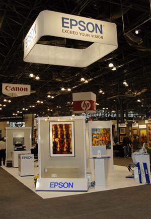
http://www.wide-format-printers.org/wide-format_aqueous_water-based_indoor_signage_printers_cost_price_comparisons_reviews/Epson_booth_ArtExpo393.jpg

http://www.armor-tile.com/images-WOC-2008/World-of-Concrete-Armor-tile-indoor-booth.jpg
A working definition of what an "indoor home good" is?
I would define an "indoor home good" as anything used to accentuate a living environment or is essential in homes i.e. beds, kitchen supplies, etc.
3 images of different types of possible home goods:

http://www.us.kohler.com/onlinecatalog/550wide/aab14982.jpg

http://content.eformation.se/savemysofa/images/products/large/IKEA_tomelilla_688-812-06.jpg

http://www.halogen-lamps.org/wp-content/uploads/2010/10/Lamp-Desk.jpg
Cabela's: http://www.cabelas.com/
REI: http://www.rei.com/
Dick's Sporting Goods: http://www.dickssportinggoods.com/home/index.jsp
Bass Pro Shops: http://www.basspro.com/homepage.html
Gander Mountain: http://www.basspro.com/homepage.html
3 images of trade show / exhibition booths from the outdoor recreation and sporting industry:
Q-Yield Outdoor Gear Ltd. : http://www.qycamping.com/en/index.asp
http://image.made-in-china.com/7f3j00dvMtrAkykEWC/Exhibitor-posted-the-Audited-Supplier-medal-in-his-booth-which-was-granted-by-Made-in-China.jpg
http://www.modawards.com/images/bestGreen.png
Links to the websites of 5 manufacturers or retailers who specialize in indoor home goods products:
Lehman's: http://www.lehmans.com/
Bed Bath and Beyond: http://www.bedbathandbeyond.com/default.asp?
Pottery Barn: http://www.potterybarn.com
Ikea: http://www.ikea.com/
Restoration Hardware: http://www.restorationhardware.com/
3 images of trade show / exhibition booths from the indoor home goods market:
http://www.stand-united.co.uk/assets/images/uploaded/project/78/P9209208.jpg
http://www.wide-format-printers.org/wide-format_aqueous_water-based_indoor_signage_printers_cost_price_comparisons_reviews/Epson_booth_ArtExpo393.jpg
http://www.armor-tile.com/images-WOC-2008/World-of-Concrete-Armor-tile-indoor-booth.jpg
A working definition of what an "indoor home good" is?
I would define an "indoor home good" as anything used to accentuate a living environment or is essential in homes i.e. beds, kitchen supplies, etc.
3 images of different types of possible home goods:
http://www.us.kohler.com/onlinecatalog/550wide/aab14982.jpg
http://content.eformation.se/savemysofa/images/products/large/IKEA_tomelilla_688-812-06.jpg
http://www.halogen-lamps.org/wp-content/uploads/2010/10/Lamp-Desk.jpg
Assignment 04: Letterform Seek & Find

Door handle in the shape of a "J"

Light switch "i"

Hairdryer "L"

Hair Straightener "V"

Water fountain handle "Q"

Lamp top "O"

Sunglasses case "D"

Bed post "F"

Lamp "T"

Computer bag "M"

Heel straps "X"

Sunglasses "B"
Sunday, May 1, 2011
Reading Reflection 02
So far I am thoroughly enjoying reading Cradle to Cradle by William McDonough and Michael Braungart. Although I have only read a small segment of the book it really does a great job of making you think about the environmental issues that are associated with design. I liked how the authors gave a brief history into their lives and described what inspired them to team up and try to conquer the detrimental effects that industrialization has had on the environment. The introduction of the book poses many questions to the readers that get you in the mindset of the content and start to open your eyes to some of the problems that designers face and have sometimes turned a shoulder to. It uses lists of contents in widely used products in an effort to grab the readers attention and have them wanting to learn more. I think that is one of the most important components when someone is trying to get their point across and make a bold stand for something. Gabe gave us some initial background information regarding the book and specifically how it was produced. The book is printed on synthetic paper. It is "not only waterproof, extremely durable, and recyclable by conventional means;...as a product can be broken down and circulated infinitely in industrial cycles". The fact that the authors decided to print their book on this material and then go on the talk about it in their book further emphasizes the stand they are taking. If they talked about environmental concerns and then printed hundreds of thousands of books on paper it contradicts the point they are trying to make.
John Heskett discusses identities in his book, Design. He talks about many different companies such as IBM, Apple, and BP. I think Apple is a great example of the point he is trying to make that the combination of image and identity is what makes a successful company. They mastered the idea of "less is more". Their logo or visual imagery, which people associate to the company is a rainbow apple. It is so simple yet it is one of the most recognizable logos in the world. Apple's identity, which is "how the image is understood by customers, or their expectations of the company", has been backed by the continual production of good products that appeal to customers needs and wants. Heskett also talks about Systems in his book. There is way more design that goes into transportation and the production of street signs that I could even imagine. However, when I think about what I see when I am driving it makes complete sense. The highway signs are different colors that regular signs and no matter where you are driving everything remains in the same spot on the signs to make it easily recognizable to drivers. It is subconscious for drivers to look in a certain spot for the speed limit or the number of miles to a specific destination. I thought that was very interesting and not only ensures driver safety so they can focus their concentration on the road, but also so it is universal.
John Heskett discusses identities in his book, Design. He talks about many different companies such as IBM, Apple, and BP. I think Apple is a great example of the point he is trying to make that the combination of image and identity is what makes a successful company. They mastered the idea of "less is more". Their logo or visual imagery, which people associate to the company is a rainbow apple. It is so simple yet it is one of the most recognizable logos in the world. Apple's identity, which is "how the image is understood by customers, or their expectations of the company", has been backed by the continual production of good products that appeal to customers needs and wants. Heskett also talks about Systems in his book. There is way more design that goes into transportation and the production of street signs that I could even imagine. However, when I think about what I see when I am driving it makes complete sense. The highway signs are different colors that regular signs and no matter where you are driving everything remains in the same spot on the signs to make it easily recognizable to drivers. It is subconscious for drivers to look in a certain spot for the speed limit or the number of miles to a specific destination. I thought that was very interesting and not only ensures driver safety so they can focus their concentration on the road, but also so it is universal.
Journal 05: Peer Dialogue #2
Erica
Erica and I were partners for the scavenger hunt and I found it interesting the facts that she included with the pictures. I learned even more about all of the clues even though we had the exact same pictures. I also liked that she touched on the accessibility lecture in her course review, as well as mentioning the video about the wheelchair. I agree with what she said. It is sad that such an innovative product that could help so many people was unable to hit the market (http://design200spring.blogspot.com/2011/04/course-reflection-02.html). We shared a similar interest in the lecture about environmental products and all of the videos. I enjoy reading about other peoples interest and seeing where I have common interests as other people.
Jonathan
Once again I enjoyed going through Jonathan's blog and seeing all of the other things he has added besides the assignments. I liked reading his designer blog because whenever I first think about NASA I don't think of design, but that is exactly what it is. Yet again it shows that design is incorporated into many more things that I originally thought. He took a different approach to the found faces assignments in some of his pictures then I viewed it. I think its interesting how he interrupted it differently and it shows how everyone has their own creativity and that's what allows for millions a new ideas everyday. (http://design200.wordpress.com/2011/04/25/j04-found-faces/)
Becky
I really liked looking through Becky's designer blog and reading about the people that she researched. I had never seen the "bookworm" bookshelf by Ron Arad or the museum he had designed but both were very intriguing. (http://bbeaulieu11.blogspot.com/2011/04/a02.html) It is awesome that the bookshelf is flexible and can be shaped in anyway the user wants. I thought it was funny how Becky and Erica (and a bunch of other people in class) found faces in many of the same things. It is crazy how faces come up in a lot of the products that we use on a daily basis. I also liked how she added commentary to each of her pictures because after reading them and then looking back at the picture the products really do look like what she said.
Sunday, April 24, 2011
Course Reflection 02
My favorite lecture by far has been the one surrounding environmental design. I have always been very involved in giving back to the community and I think its great when people use their talents and knowledge in order to help people that are less fortunate than themselves. I enjoyed the video with Jane Chen where she explains her and her designers new product to help keep premature babies incubated for an affordable price for people who live in poverty. It looked like a tiny sleeping bag and used a hot pack to insulate the blanket. This is an ingenious idea that will help save millions of lives and all it took was for a group of people to really care about the cause. Similarly the video with Michael Pritchard was incredible. The fact that all you need to do it pump a water bottle full of water several times could bring millions of people clean water everyday is miraculous. He was so adamant about the cause and helping to save lives and that is what was really touching.
I really liked doing the scavenger hunt. It gave me further insight about the history of Ohio State as well as what important designs are all around campus. It is so much more memorable to walk around campus and find the designs then just talking about them in class.
I am glad we did the lecture on accessibility because it opened my mind to obstacles that I pass daily but never put any thought to because it doesn't directly affect me. However, becoming aware of how the littlest things can affect such a wide range of people really made me realize that this is a very important issue in society today and needs to be addressed as readily as possible.
Although the design process lecture was kind of dry I still feel like it is information that is very important to know in order to understand what design actually is and what goes into designing a product or an idea. It definitely involved a lot more steps than I realized. Even though I think that every step is vital to the process. I think that the evaluation step is key because designers will never truly know how the public with respond to their product. Once the product is released if the public responds positively and it benefits the users then its a job well done. However, if there is a negative reaction. It is pertinent for designers to figure out what went wrong, what people didn't like, etc. in order to fix the product and turn it into a good product. The worst thing that can happen to a company/designer is a bad reputation for their products. So they need to be ready to react in case something doesn't go as planned to get the products back in a positive light.
Assignment 03: Hunting Down Design
My partner for the scavenger hunt was Erica Loughry and you can access her blog by following this link: http://design200spring.blogspot.com/.
As for division of labor we both went around to every location and took turns being in the pictures using her camera. Before we even started the hunt, we used my computer to figure out/double check where all of the clues would lead us because we thought that this was the most efficient method given the assignment. We used a lot of our prior knowledge from the field trip in order to locate many of the designs. Working in a small group definitely made it easy to communicate as well as have a chance to see all the designs for ourselves.
Clue 1:

Erica is pondering in the Barcelona Chair which we found in the Knowlton School of Architecture Library. This chair was designed by Ludwig Mies van der Rohe in 1929 and is considered to be an icon of modernism. Mies derived this idea from ancient Roman folding chairs. The Barcelona Chair was designed for the Spanish Royalty to oversee ceremonies.
Clue 2:

Above is a copy of the "Harvard Design Magazine" (published by the Harvard Graduate School of Design) that I am reading in the following picture. We found this chair in the Knowlton School of Architecture's Library. It is the Red and Blue Chair designed by Gerrit Reitveld in 1917. The chair was originally painted white, black, and grey and was one of the first designs made through the De Stijl art movement which emphasized geometry.

Clue 3:

This is me in front of the Wexner Center for the Arts designed by Peter Eisenman. The design includes large, white metal which gives it a scaffolding feel. Eisenman intended this to give the building a sense of incompleteness. He analyzed the street grids of OSU and the city of Columbus and represented these angles through the metal gridding. Originally when it was built, there were open windows where light shined brightly into the art gallery. This caused some controversy which lead the university to redesign the windows to block the light and save the artwork from fading.
Clue 4:

Philip Johnson is responsible for the design of both the Math Tower and the Science and Engineering Library at Ohio State. The picture both is located in front of the Math Tower where Erica is posing on the stairs. Below in an up close picture of the top of the building which we thought was interesting. There is one larger arch which is surrounded on both sides by smaller arches. This seems to demand the attention of the observer towards the center of the building. Also I like the small half circle windows that are further divided in half. It reminds me of a pie graph, which is math related (seems appropriate for the building!).

Clue 5:

Journal 04: Found Faces
The eight pictures below I took but it was with my phone because my camera broke and I haven't had time to replace it yet so they are kind of poor quality (sorry). I also looked online and found a lot faces on this website http://www.urlesque.com/2010/05/21/74-funny-faces-in-objects/ that I did a great job of representing faces in objects that aren't necessarily supposed to have a face.

Double outlet on the floor of Thompson Library

Side of the Math Building

Port-a-potty outside of the Jesse Owens

Architecture on the outside of College Traditions

The front of my Madza 3

The inside of my car (air vents represent eyes and the CD player=mouth)
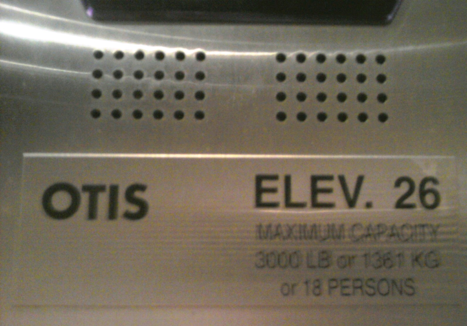
Speakers and notification inside Thompson Library elevator

Part of my bracelet consisting of 2 beads as eyes and the heart charm as the mouth

I just found this in my old pictures. It is a lookout binocular at Niagara Falls
Sunday, April 17, 2011
Reading Reflection 01
"Abstraction enables capacities to be separated from specific problems, to be generalized, and flexibly adapted to other problems" (11). This quote really stuck out to me when I was reading "Design: A Very Short Introduction" by John Heskett. The book essentially goes on to say how a basic concept or idea can be used to develop very intricate innovations that could never have been derived from human form or nature. I was in awe when I read this. Not only was it worded so well that the reader could actually visualize these events but it gives an intricate explanation of how everything has evolved throughout life, whether is be science or language or inventions. I enjoyed reading the chapter in the historical evolution of design. It is amazing to me that we can trace design all the way back to the prehistoric ages. I find the era of industrialization interesting because it was a time of much trial and error as well as much criticism and confusion. It put a lot of things in perspective and gave insightful information about how design came about.
The ideas of form and function were mentions several times throughout the reading and this is a concept we payed close attention to in class. On page 25 John Heskett quotes Louis Sullivan's concept that "form follows function". It was helpful for me when trying to understand this concept that the book broke function into the two concepts of utility and significance. However, the significance of a product or design differs across cultures. An object that means something to one culture may have none in another. Significance can change throughout time and I think this is a very importance idea. Many times my parents talk about how "big" a product was back when they were my age and I look at them like they are crazy because I have never even heard of it. It just goes to show you that as time passes products and ideas become more and more sophisticated.
In Chapter 4 Heskett discusses "designer-brands". The "in" brands, which are usually associated with high prices like designer bags or jeans, are objects that people only buy so that they can say that they have that particular glorified item. He talks about how products are made for merely fashion and status, having no actual purpose, and if they do the product is much more likely to break or work poorly for an extremely inflated price. You can see this phenomenon happening throughout the world today. It is human nature to be competitive with one another, always trying to one up each other. In many ways, wealth has an extreme influence over who is the most "powerful". By having objects on display such as expensive cars, jewelry, and the newest gadgets people are showing off to the world what they have. The car may not work any better than your average priced car, but the fact that it has the brand name associated with money makes all the difference.
Heskett details the differences between areas of specializations and how depending what they are trying to portray (i.e. overall aesthetic effect for homes, hotels or restaurants and equipment for specific purposes like hospitals or schools). The line that "people invest objects with personal meaning" (69) stuck out to me. When my mom redecorates a room in our house every so often, she is so indecisive about all of the elements going into the room. It makes sense to me now because our home is essentially a collection of our family and every element has significant meaning. So when redecorating a room, she wants to make sure that it is going to incorporate elements of our family some way or somehow. Also the home is the only place where a person is able to have things exactly how they want, in a manner that is pleasing to them.
I found the chapter 1-6 reading to be very interesting. I was slightly apprehensive when starting to read because I was afraid of the typical dry textbook material, but I actually found it be very informational in a manner that was engaging for the reader.
Journal 03: Peer Dialogue #1
For this journal, I looked over the blogs of three of my other classmates to see how our ideas and views of the class are similar and different.
For Erica_L:
I noticed that we both did Jonathan Ive for one of our designer responses and it was interesting to see what other information she was able to dig up that I did not find. I also thought that her response on Fred and Friends was interesting. I have never heard of them but I really thought their products were cool. Like the Air Fork One ( as shown herehttps://blogger.googleusercontent.com/img/b/R29vZ2xl/AVvXsEgVTiHRbYs3A7U1pIDB2rWxAnRvANxPVadxRf89dB57ZdLBrACFawpYYIsg3QcUdTAgCJtR_0s5NkCIomvZKga2iMRhJIR9ilfOKFWFMdzF4Z5yhbblRV4u6CxqOwzHtiuoDWAZE_KUMvs/s1600/fork.png) is a really cute idea for kids. I also found it interesting that she is an ISE major because I considered that major for a while and am actually thinking of changing my business specialization to operations which is kind of like the business side of ISE.
For Jonathan_T:
Jonathan was my partner on the first day of class when we introduced other classmates. He seemed like a really interesting person and was passionate about many things. His blog further emphasizes my initial impression of him. He is not only using his blog for Design 200 but also for his photography class and for simple pleasure to update people on the things he finds interesting. For instance he posted a link to his brothers mixtape (http://design200.wordpress.com/2011/04/13/who-vol-2/) which I took a minute to listen to and it was good. I definitely got some unexpected entertainment from visiting his blog.
For R. Becky_B:
I really liked that some of her patterns came from nature. I am in love with fruit so the grapefruit pattern definitely caught my eye. She did a great job of not only capturing the vibrant colors and catching the light at the perfect place to emphasize the pores/patterns of the fruit but also making it almost seem like the juice was coming through the picture (https://blogger.googleusercontent.com/img/b/R29vZ2xl/AVvXsEgje49IfkqIQjSeg0T2ebncsqh2cmkwetzKsvJTIIEc9SadjMUFpKECKxUq5MpOi5zVHs8XF6LHD8yX-DvfUw89tHneBnD3d4d2aTX9LwNca3agRVIAi_rXRvrfWQphe5xfu_ULMfwx/s1600/IMG_1034.jpg). I am glad to see that she was also unaware the other areas of design besides visual communications. I definitely thought that there was an aspect of design that went into making products but I associated it mainly with engineering. So I agree with her that I can't wait to see what else this class opens my eyes to.
Designer Response Long
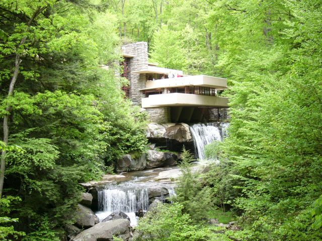
"The interior space itself is the reality of the building" are words uttered by Frank Lloyd Wright, who is considered by most to the twentieth centuries greatest architect, to describe how the distinction between interior and exterior can vanish and have a natural flow from one to another. Wright was born in Richland Center, Wisconsin on June 8, 1867 and died on April 9, 1959. He was raised by his father who was a minister and a music teacher and his mother who was a teacher. He was raised on strong unitarian, transcendental principles. He attended University of Wisconsin School of Engineering but dropped out soon after starting and moved to Chicago. In Chicago he teamed up with Louis Sullivan, who mentored him during his early years as an architect. Growing up during the Industrial Revolution gave him the tools he needed to build the buildings his imagination created, while his transcendental background provided him with a driving sense of human values. He is known for initiating the progression of American architecture from classicism towards a new ideal. He named the style of his buildings "organic architecture" which essentially meant that wherever it stood in time, it would be appropriate to the current time, place, and man. He believed in continuity and integrity within his works. All parts were to be related to the whole as the whole was related to the parts. He claimed that he was able to map through all the great architectural contributions throughout time and eliminate many that were merely constructed for fashion, not for purpose. Wright developed several concepts throughout his career that changed how architect was viewed. One concept he called "open plan" which was an idea within homes where there would be more open spaces, screened off from one another by simple architectural devices rather than by walls or doors. Another was the integration of the building with its natural site. He did this with large open windows where light could shine in and the idea of features instead of walls so people could get that feeling that they were actually outside, surrounded by nature. His third major idea was known as the prairie home. He developed this idea because at the time many families were starting to build in areas that were flat and you could see for miles. He wanted to get the family off the ground to provide a wider outlook of their view. Instead of the basement being underground he made it on the ground floor and then the first floor would be elevated above ground. Frank designed many buildings throughout his career. The Johnson Wax Building, Kaufmann's Fallingwater, The Johnson Wax Research Tower and Price Tower, and the Guggenheim Museum are some famous examples of his works. All of these embody the use of reinforced concrete (steel and concrete mix) which was first developed and used by Wright and was a huge innovation of the time. The Guggenheim Museum creates the concept of fluid space flow, which had never been seen before and was originally criticized by many people. However, Wright had a vision in mind that the museum-goer would take the elevator up to the top of the museum and then gradually spiral downward seeing all of the pieces the museum offered without without having to weave through spaces more than once. An original concern for painters who would have their pieces displayed throughout the museum was that the walls would take away from their paintings. However, Wright proved that the slightly sloped walls would actually let the painting be seen in a better perspective and be better lighted then if they were set on a flat wall. This was a new but sound idea that made artists uneasy at first, but set a precedent for the future. Fallingwater is my favorite of Wright's works. Maybe because I have been their several times and so I know it the best, or possibly because I am intrigued by how incredible the building to nature design flows. It was deemed a National Historic Landmark in 1966. Fallingwater is a concrete and stone terrace that projects out and over a waterfall in a wooden area of western Pennsylvania. It was built on boulders so the fireplace is formed with their integration and there are also parts of the rocks that come through that living room floor to further emphasize the ties with nature. The design of piece was largely based upon Japanese culture and architecture which Wright was extremely passionate about. It focused on the importance of joining inner and outer spaced together and emphasized the harmony between man and nature. Throughout his lifetime Wright received much recognition for his achievements. He received gold medal awards from the Royal Institute of British Architects and the American Institute of Architects. Not only was Frank Lloyd Wright an amazing architect, he was also a well respected interior designer, writer, and educator.
Fallingwater: http://en.wikipedia.org/wiki/File:FallingwaterWright.jpg
The Price Tower:http://en.wikipedia.org/wiki/File:Price_tower.jpg

The Guggenheim Museum: http://en.wikipedia.org/wiki/File:Guggenheim_museum_exterior.jpg

Fallingwater: http://en.wikipedia.org/wiki/File:FallingwaterWright.jpg
The Price Tower:http://en.wikipedia.org/wiki/File:Price_tower.jpg
The Guggenheim Museum: http://en.wikipedia.org/wiki/File:Guggenheim_museum_exterior.jpg
Works Cited
"Frank Lloyd Wright." Wikipedia, the Free Encyclopedia. Wikimedia Foundation, Inc, 12 Apr. 2011. Web. 15 Apr. 2011. <http://en.wikipedia.org/wiki/Frank_Lloyd_Wright>.
Larkin, David, and Bruce Brooks. Pfeiffer. Frank Lloyd Wright: the Masterworks. New York: Rizzoli in Association with the Frank Lloyd Wright Foundation, 1993. Print.
Subscribe to:
Comments (Atom)